Quiet does not mean passive
A calm website can still be persuasive. In fact, the strongest service sites often feel quieter than expected because they are not trying to solve every trust issue with noise. They use proportion, spacing, and simple language to make the business feel established.
The faster the internet becomes, the more valuable calm becomes. Visitors are used to being interrupted by popups, banners, movement, and crowded blocks of content. A page that knows what to emphasize can feel like a relief.
The page should have a reading rhythm
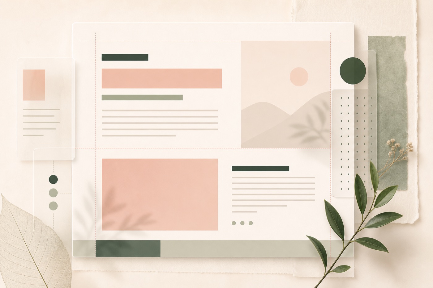
Editorial design is useful for the web because it understands pacing. A strong page alternates between orientation, detail, proof, and action. It does not make every section the same size or give every idea the same visual weight.
Typography does a lot of this work. A generous heading, a concise paragraph, a restrained label, and a clear button can create hierarchy without extra decoration. The goal is not to make the page sparse. The goal is to make the page legible at a glance and rewarding on a slower read.
Calm design still has to convert
Beautiful whitespace should never hide the path forward. The visitor still needs to know what the business does, who it serves, what action to take, and why the next step is worth their time.
A calm website converts by lowering friction. It makes the offer easy to understand, gives each section a job, and removes the visual clutter that makes a visitor hesitate. The result feels elegant, but the underlying structure is practical.
What to carry forward
- Use spacing to create order, not to create emptiness.
- Let headings, captions, and calls to action carry distinct roles.
- Design for scanning first, then reward the visitor who reads deeper.